CSS web layout
CSS or cascading style sheets is a set of rules that enhance the appearance of web pages. In the early years of the internet browsers adopted CSS because it presented an opportunity for better visual designs and more creativity.
As browsers continue to develop and grow beyond traditional devices, CSS’s capabilities developed in parallel.
This development includes the introduction of responsive design in CSS and has further grown from there with layout options such as flex boxes, grids and boxes.
And you could argue that layout is one of the most important components of designing a good web page because layouts help divide a page into different sections, thus making the page more presentable.
CSS can be used to enhance a web page by modifying fonts, colors, layout, size and other style formatting options that make the web page more presentable.
The browser window that is visible to the user on the screen is called the view ports. In essence, the idea behind any CSS web layout is to create an optimally designed web page that has a good view ports at any given point.
In other words, CSS layouts are all about how the content of your web pages organized.
Display
When it comes to creating layouts using CSS, an important property is the display property.
The display property specifies the type of box that you want to use for a given html element. You might remember from an earlier course that the display property determines if a rendered boxes in line or block.
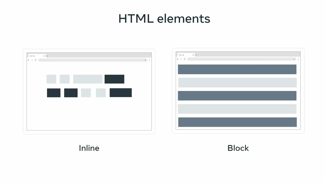
Box models allocate rectangles or boxes to html elements so CSS rules can be applied.
For example, the relative CSS rule for a html element with an ID named sample would contain display property with a block value.
Relative CSS rule

#sample {
	display: block;
}
Evolving requirements
The code changes the property of the display box to a block type. Layouts created using the block type are good, but evolving requirements led to the development of CSS web layouts such as flex box and grid, which helped create rules for multiple elements.
They added more flexibility and dimensionality with better options for fine tuning specific sections of a web page. The main difference between the two is that flex box is one dimensional while grid as the word implies is two dimensional.
Flex box
Flex box is short for flexible box model and it was introduced before the grid layout.
For example, the flex box property with an ID named sample contains the display property with flex as its value.
#sample {
	display: flex;
}
Flex box adds responsiveness to CSS with float elements and positioning. One dimensional refers to the fact that a given flex box container will arrange items in either a column or a row along its axis.
The flex box container applied over an element can flex to shrink or expand. Thus resulting in a flexible responsive design.
Grid
CSS grid is similar to the flex box except it creates a two dimensional grid along both the row and column axis.
#sample {
	display: grid;
}
For example, the grid rules for the sample ID can be added after adding the display property with the grid as its value.
While the grid increases dimensionality and helps to create an advanced layout with relative ease, it can also lead to increased complications later, if the element rules are not systematically defined.
There is no strict rule on choosing which layout to use, but in general flex boxes are more suitable when you want to create flexible elements in smaller spaces; While grids are more suitable to large scale layouts.
Widely used selectors
Selectors
CSS selectors correspond to specific elements or element groups in an HTML document.
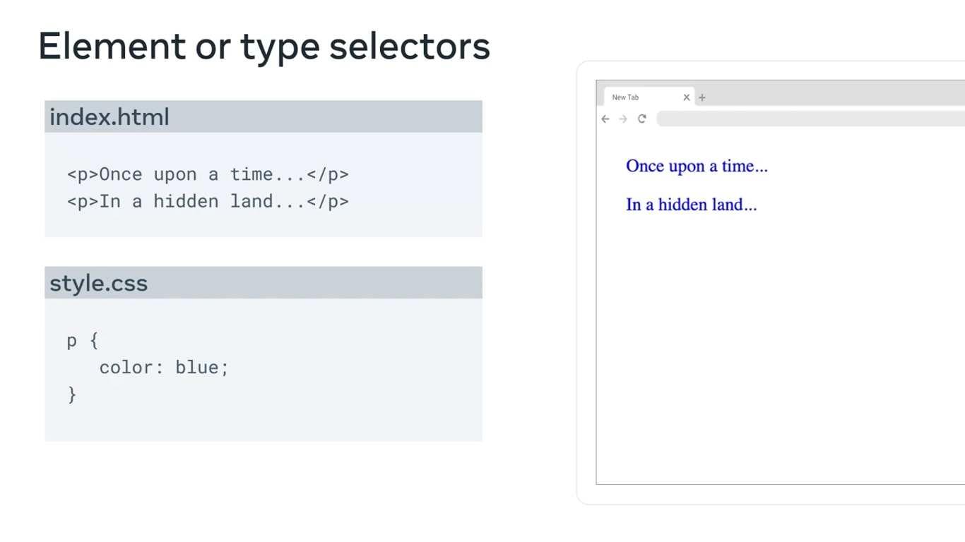
Element or type selectors
The element selector allows developers to select html elements based on their element type.
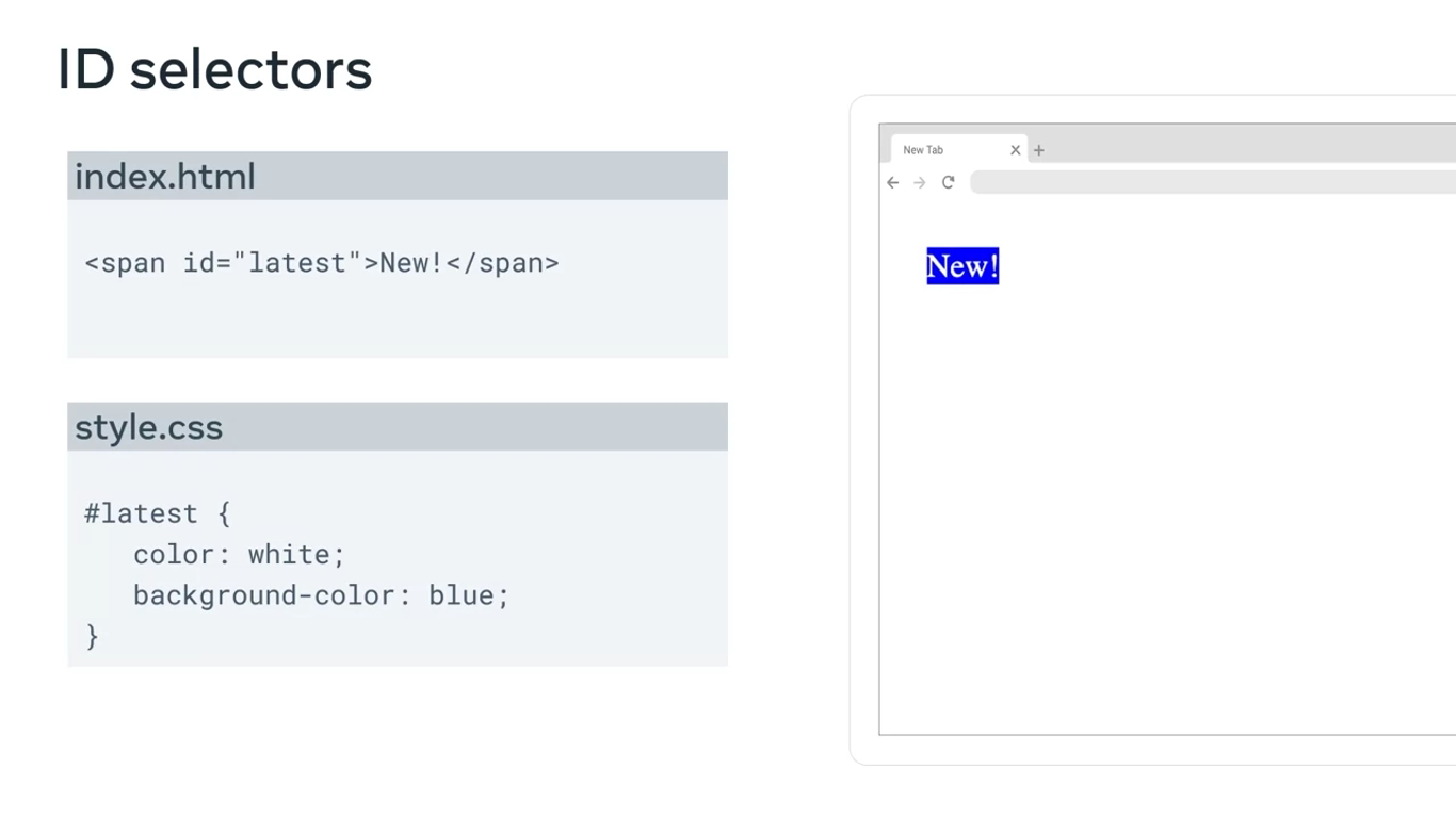
ID selectors
ID Selectors use the ID attribute of html element. Since the ID is unique within a web page, it allows the developer to select a specific element for styling.
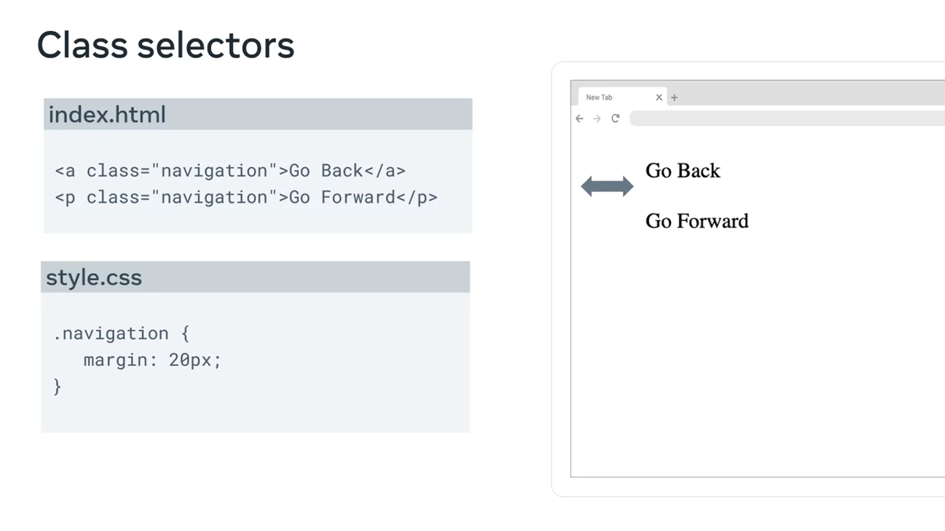
Class selectors
Class selectors allow you to select elements based on the class attribute applied to them. With class selectors, you can apply rules to all elements with the specified class name.
As the CSS code based evolved over time, more selectors were added to improve the design and styling effect of CSS.
Attribute selectors
The attribute selector has a few syntax variations.
Syntax variations
[attr=value]{}
[attr~=value]{}
[attr$=value]{}
[attr*=value]{}
among others..
Attribute selectors match the attribute of value for a given element.
Attribute and Value
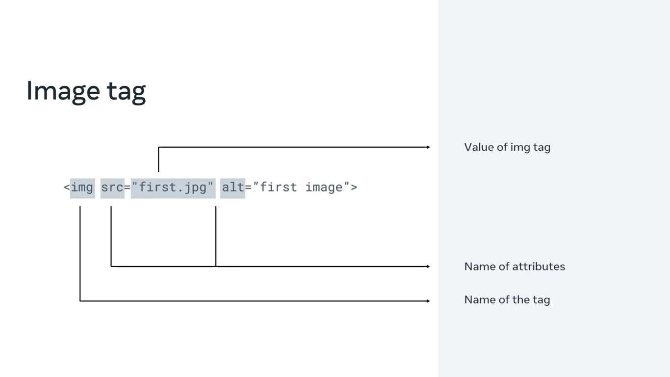
A quick recap, let’s say you have a html image tag, img is the name of the tag, while src and alt are the names of its attributes. The actual name of the image file, first.jpeg is the value.
Say you have an html file with three a tags, each with a h ref attribute that points to a different page on the meta website. The first one has no class, whereas the second one has a class called home, and the third class called about.
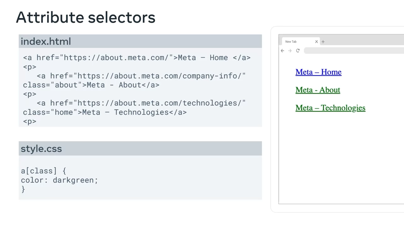
With different variations of the attribute selectors you can target different attributes of the html. For instance, you can style all elements that have a defined class by adding class inside the square brackets. In this case, it will turn the second and third link green.
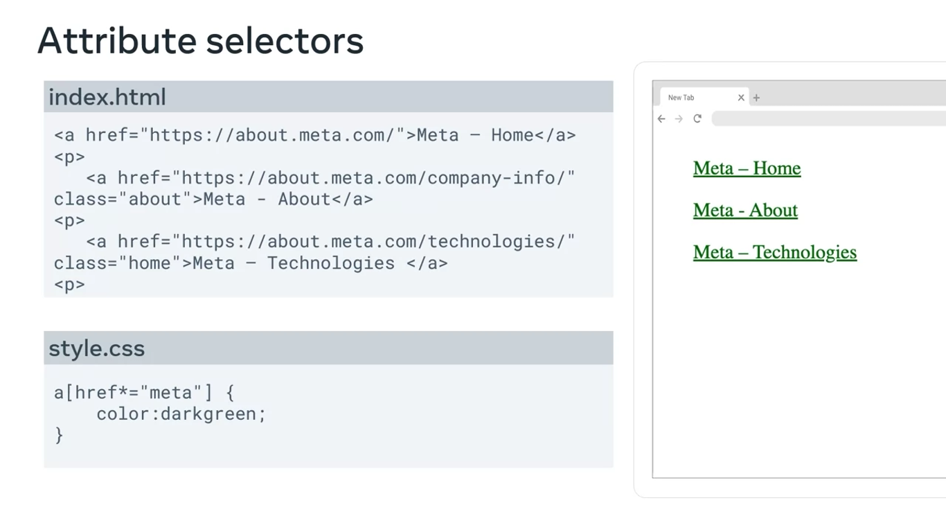
Alternatively, you can target all three elements by inserting the href attribute, a star and a common value that is part of all the links that you want to target. In this case, it can be the text meta. Now all three links will be green because each link contains the word meta.
Or you can target only the first element by adding the specific link as the value of the href attribute, that you want to target inside the square brackets.
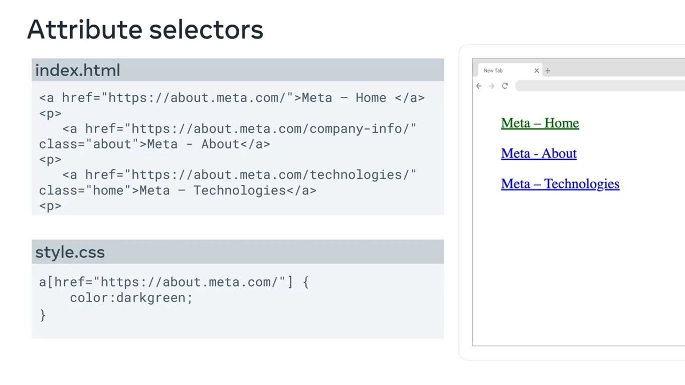
Wherever there is an attribute on a web page, you can use some variation of an attribute selector to modify it. This makes attribute selectors a very flexible styling tool.
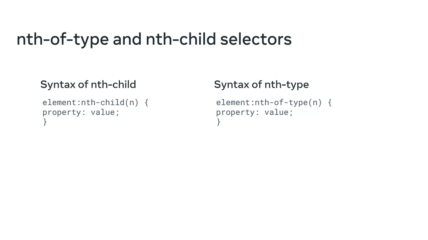
Nth-of-type and nth-child selectors
The syntax of these two selectors is very similar. As their name suggests, these selectors target the nth-child or nth-type of a specified parent element.
Parent
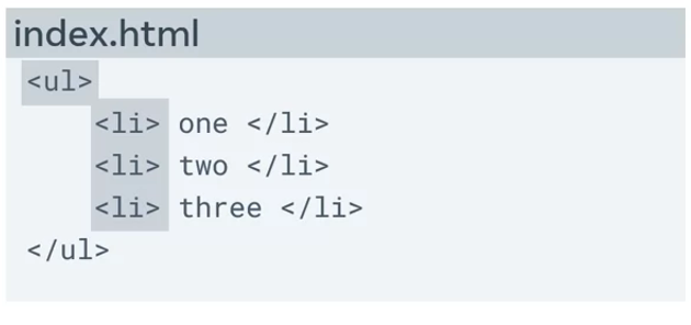
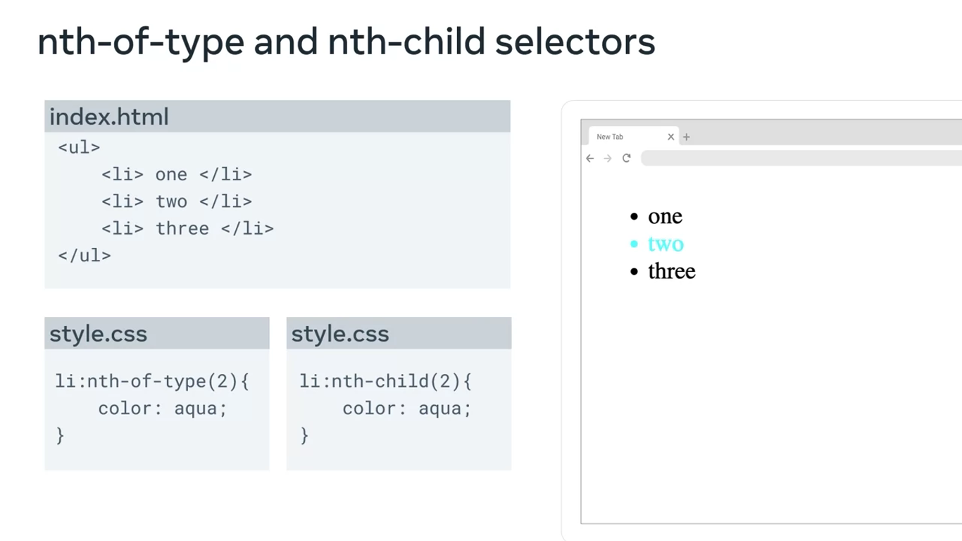
Say you have a few list elements in an unordered list element. The unordered list element is the parent tag in this case, and the three list elements are the children.
Now let’s specify that the second list element must have a certain styling. In this case, you can use both the nth-of-type and the nth-child selectors to do that. Both will produce the same output, where the second list element will be colored aqua in this case.
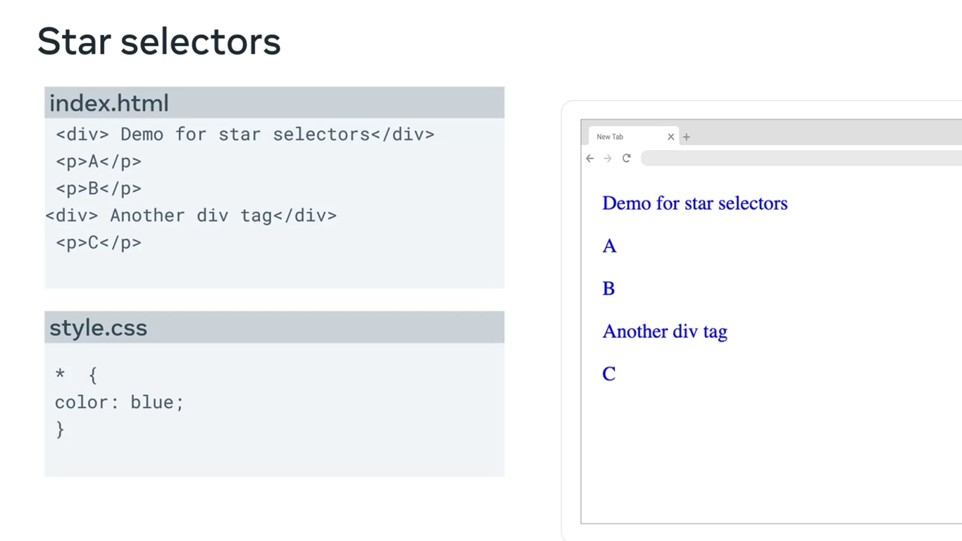
Star selector
Just like in many other programming languages, star selectors are used for selecting all the elements of a web page. It will affect all the elements in the html file.
*{
	property: value;
}
It is especially helpful when you want to reset the default settings and styles that browsers use before they apply your styling to the web page.
Group selectors
Finally, did you know that you can group selectors? If you want to apply the same styling to more than one type of element, like the heading one and paragraph elements you can use group selectors.
Instead of using element selectors where you use a rule for every element, such as heading 1 and P you can type h1, p and then add the CSS properties.
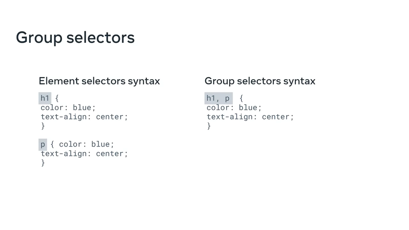
The CSS rule will then be applied to all heading one and paragraph elements.
They’re also called selector stacking.
CSS units of measurement
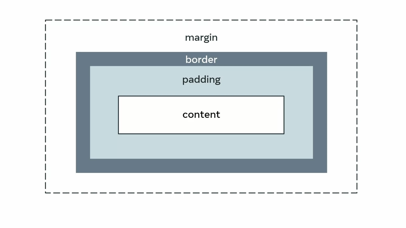
A web page, as you know it, is two-dimensional. In other words, it has width and height. There are a number of other ways you can express this such as vertical and horizontal, length and breadth, x and y axis and so on. Another property of a web page is its size which can either be static or dynamic. When you’ve encountered enough CSS code, you will note a number of different ways in which the values for the same property can be declared using different units of measurement. Most of these units of measurement are used to account for the dynamism and dimensionality of a web page.
Let’s examine the most widely used units of measurement. They can broadly be categorized as Absolute and Relative units.
Absolute units
Absolute units are constant across different devices and have a fixed size. They are useful for activities like printing a page. They are not so suitable when it comes to the wide variety of devices in use today that have different viewport sizes. Because of this, absolute units are used when the size of the web page is known and will remain constant.
The table for absolute units can be seen below:
| Unit | Name | Comparison |
|---|---|---|
| Q | Quarter-millimeters | 1Q = 1/40th of 1cm |
| mm | Millimeters | 1mm = 1/10th of 1cm |
| cm | Centimeters | 1cm = 37.8px = 25.2/64in |
| in | Inches | 1in = 2.54cm = 96px |
| pc | Picas | 1pc = 1/6th of 1in |
| pt | Points | 1pt = 1/72nd of 1in |
| px | Pixels | 1px = 1/96th of 1in |
Of these, the pixels and centimeters are most frequently used for defining properties.
Relative values
When you create a web page, you will almost never have only a single element present inside it. Even in case of containers such as flexboxes and grids, there’s usually more than one element present that rules are applied to. Relative values are defined ‘in relation’ to the other elements present inside the parent element. Additionally, they are defined ‘in relation’ to the viewport or the size of the visible web page. Given the dynamic nature of web pages today and the variable size of devices in use, relative units are the go-to option in many cases. Below is a list of some of the important relative units.
| Unit | Description and relativity |
|---|---|
em | Font size of the parent where present. |
ex | x-co-ordinate or height of the font element. |
ch | Width of the font character. |
rem | Font size of the root element. |
lh | Value computed for line height of parent element. |
rlh | Value computed for line height of root element which is . |
vw | 1% of the viewport width. |
vh | 1% of the viewport height. |
vmin | 1% of the smaller dimension of viewport. |
vmax | 1% of the larger dimension of viewport. |
% | Denotes a percentage value in relation to its parent element. |
Many of these units are used in terms of the relative size of fonts. Some units are more suitable depending on the relative context. Like when the dimensions of the viewport are important, it’s more appropriate to use vw and vh. In a broader context, the relative units you will see most frequently used are percentage, em, vh, vw and rem.
Much like the absolute and relative units discussed above, certain properties have their own set of acceptable values that need to be taken into account. For example, color-based properties such as backgroundcolor will have values such as hexadecimal, rgb(), rgba(), hsl(), hsla() and so on. Each property should be explored on an individual basis and practicing with the code will help you to decide which of these units of measurement are the most suitable choice.
Document flow - block vs. inline
[[4.CSS Basics#[Document flow - block vs. inline](https //www.coursera.org/learn/introduction-to-back-end-development/lecture/mX2z2/document-flow-block-vs-inline)]]
Basic flexbox
Flexboxes are more suitable to use for simple layout or designing simple elements in a page.
Most common uses of flexbox
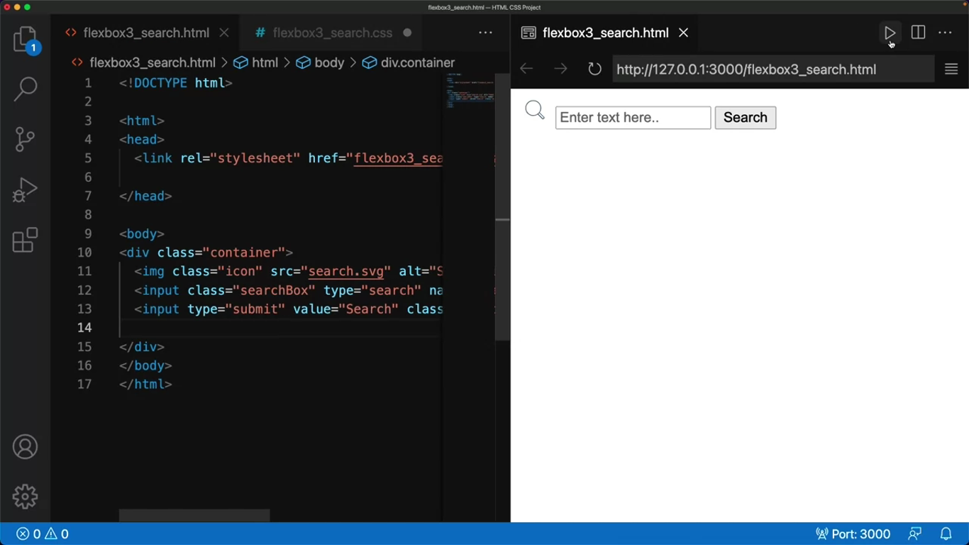
Search bar
You can use flex in search bars because it ties up all the elements, such as the small Search icon, the search input area, and the Submit button.
Navigation bar
You can create the navigation bar using flex, which consists of several different layouts, and it makes your navigation bar highly responsive on different devices.
Image gallery
Finally, another type of flexbox that is commonly used is an image gallery. Flexes helpful here is it can realign itself as you change the size of the window.
Creating flexboxes
Search bar
<!DOCTYPE html>
<html>
<head>
<link rel="stylesheet" href="flexbox3_search.css">
</head>
<body>
<div class="container">
<img class="icon" src="search.svg" alt="Sample image" style="width: 32px; height: 24px;">
<input class="searchBox" type="search" name="search" placeholder="Enter text here...">
<input type="submit" value="Search" class="searchButton">
</div>
</body>
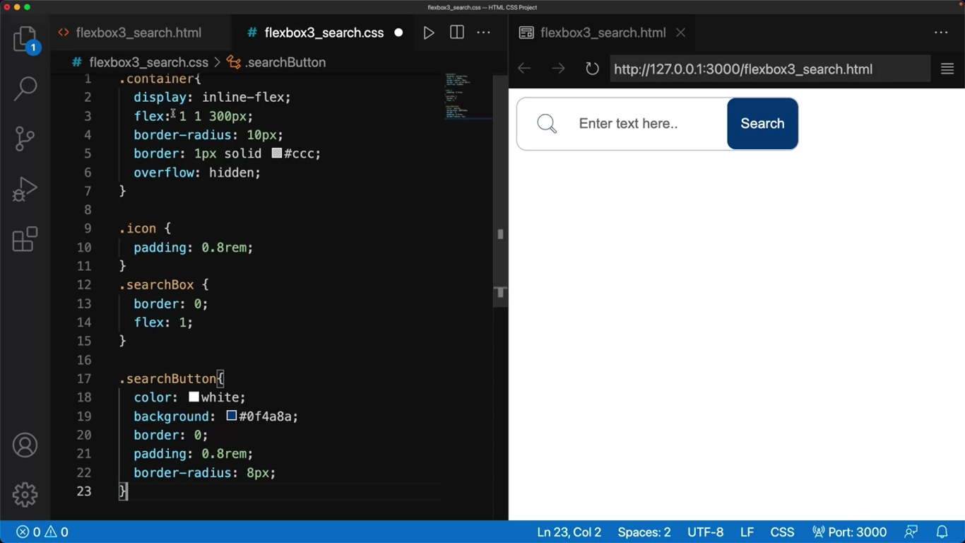
</html>.container{
display: inline-flex;
flex: 1 1 300px;
border-radius: 10px;
border: 1px solid #ccc;
overflow: hidden;
}In the CSS code, I first write rules for the container, then for the search icon, the search box, and finally for the button. Most of the properties defined here are settings for the alignment of the selectors. There are just a few important things to take note of.
The display property I use is inline flex instead of flex, which makes the flex container behave like an inline element.
Another property to take note of is the overflow. The overflow property clips the overflowing content, which in this case will be the text I enter in the search query.
.container{
	display: inline-flex;
	flex: 1 1 300px;
	border-radius: 10px;
	border: 1px solid #ccc;
	overflow: hidden;
}
.icon{
padding: 0.8rem;
}
.searchBox{
border: 0;
flex: 1;
}
.searchButton{
color: white;
background: #0f4a8a;
border: 0;
padding: 0.8rem;
border-radius: 8px;
}Let’s remove this CSS code momentarily to check how the output displays with aided. Although all the elements are there the page is standard and playing.
I add the code back to the CSS file and check the output one more time. Now the search box displays the properties that I defined in my CSS file.
NOTE
Notice that when I change the size of the page, the search area doesn’t change.
Navigation menus
<!DOCTYPE html>

<html>
<head>
	<link rel="stylesheet" href="flexbox5.css">
</head>

<body>
	<ul class="container">
		<li><a href="#">Home</a></li>
		<li><a href="#">Culinary Blog</a></li>
		<li><a href="#">Menu</a></li>
		<li><a href="#">Contact Us</a></li>
	</ul>
</body>
</html>
* {
margin: 0;
padding: 0;
}
.container {
background-color: #2b2d42;
display: flex;
flex-flow: row wrap;
justify-content: stretch;
}
.container li {
list-style-type: none;
}
.container a {
display: inline-block;
padding: 25px;
margin: 0 25px;
text-align: center;
text-decoration: none;
color: #ffffff;
}
.container a:hover {
background-color: lightsteelblue;
}Notice that in my CSS code I use something called a star or universal selector. The universal selector applies the rules to every element in my CSS code. I use this to declare any formatting that is browser specific.
Now I define the rules for the container. It’s important to notice that I use the flex-flow, which is a shorthand property specifying the direction of the flex container and its behavior for wrapping.
Another important property is justify content, which aligns the flexible containers items along the main axis. In this case, I have set it to stretch.
Since the individual elements are part of the container, I applied the rules both to the container, onto the elements which are the list items, anchor, tag, and so on.
It’s also important to notice that the page is responsive. As the size of the browser window gets smaller, the items stacked on top of each other, and if I expand the window, it changes to a standard horizontal navigation menu.
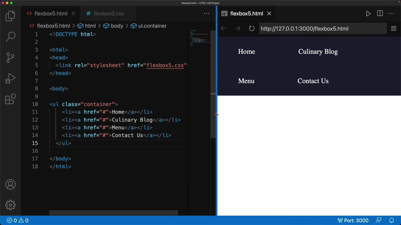
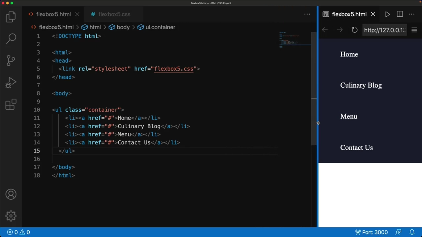
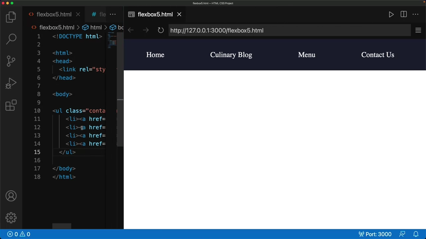
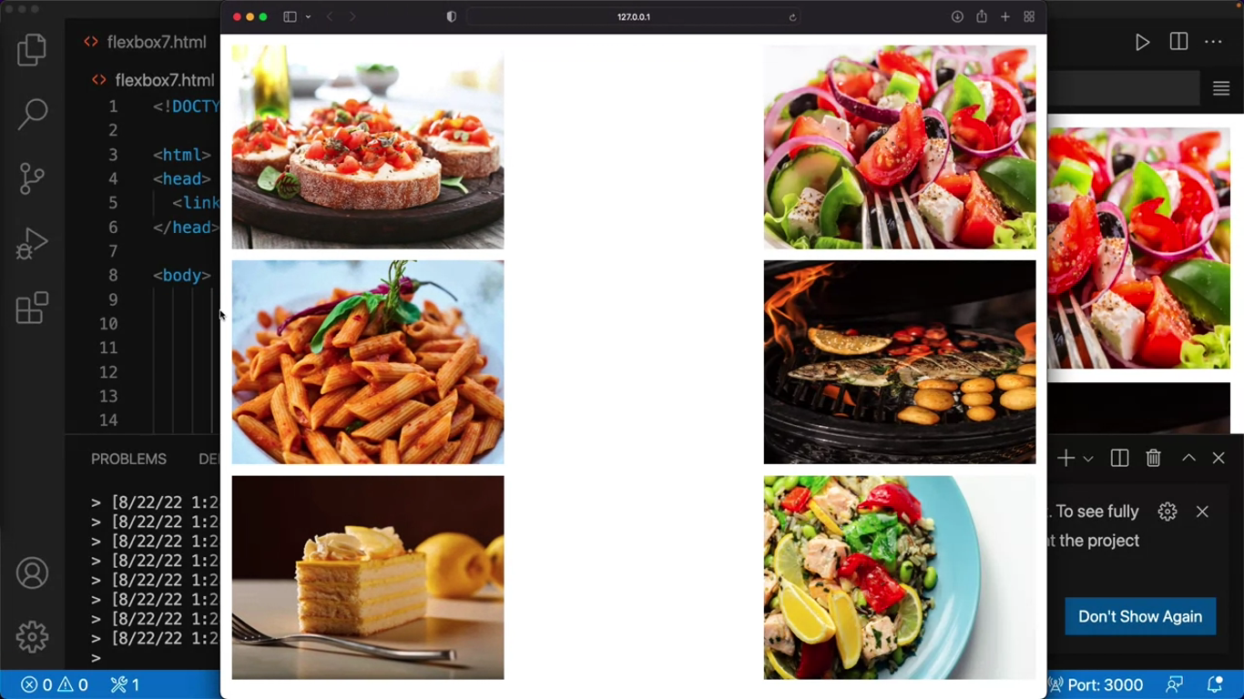
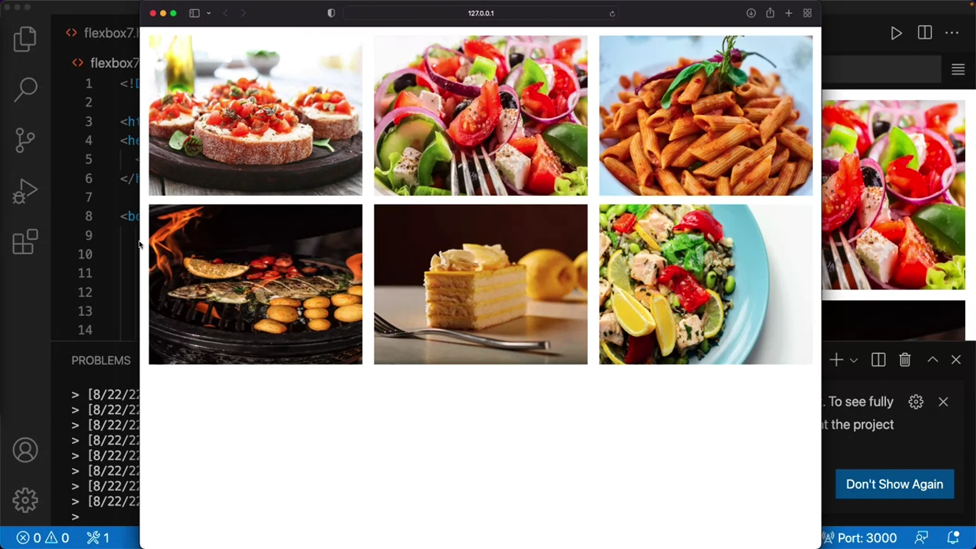
Image gallery
<!DOCTYPE html>

<html>
<head>
	<link rel="stylesheet" href="flexbox7.css">
</head>

<body>
	<div class="container">
		<img class="item" src="bruschetta.jpg" alt="Sample image" style="width: 240px; height: 180px;">
		<img class="item" src="greek salad.jpg" alt="Sample image" style="width: 240px; height: 180px;">
		<img class="item" src="pasta.jpg" alt="Sample image" style="width: 240px; height: 180px;">
		<img class="item" src="Grilled fish.jpg" alt="Sample image" style="width: 240px; height: 180px;">
		<img class="item" src="lemon dessert.jpg" alt="Sample image" style="width: 240px; height: 180px;">
		<img class="item" src="salad.jpg" alt="Sample image" style="width: 240px; height: 180px;">
	</div>
</body>
</html>
* {
margin: 0;
padding: 0;
box-sizing: border-box;
}
img {
border: 0;
}
.container {
display: flex;
flex-wrap: wrap;
justify-content: space-between;
padding: 5px;
}
.item {
margin: 5px;
}First, I remove all browser-specific settings that may be there by using the star selector just like I did earlier. I set the value of both the margin and the padding to zero. I then reset the basic alignment options for the images by setting the border to zero.
Next, let’s focus on the container. First, I set the value of display to flex, then I add the flex-wrap property which determines whether the flex items should be forced in one line or should wrap over multiple lines.
Next, I justify the content property, which aligns the flexible container items on the horizontal main axis, I set it to space dash between.
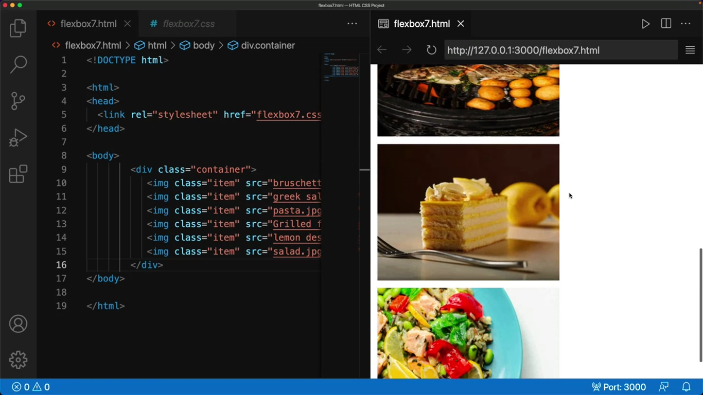
The output window is narrow at the moment, so the six images are stacked on top of each other. But when I expand the window, they spread out. One can notice the effect better in a browser, so I copy the link and paste it into my browser.
CSS grids
CSS Grid layouts are important when it comes to designing a good webpage. This is because layouts are a way to provide visual cues for a user by organizing relevant content to make it easier to comprehend.
When someone says the word grid, you probably think of lines that cross each other to form squares or rectangles.
CSS Grids
CSS Grids are two-dimensional design layouts that are responsive and compatible with browser variations. They are an alternative to other options such as Flexboxes and tables, especially when you are working with larger scale layouts.
Columns are the vertical tracks and rows are the horizontal tracks in your viewport.
Grids divide the page into rows and columns, and the space between these tracks are called gutters or gaps.
A cell is the space in a grid container where a row and column intersect.
<!DOCTYPE html>
<html>
<head>
<link rel="stylesheet" href="style.css">
</head>
<body>
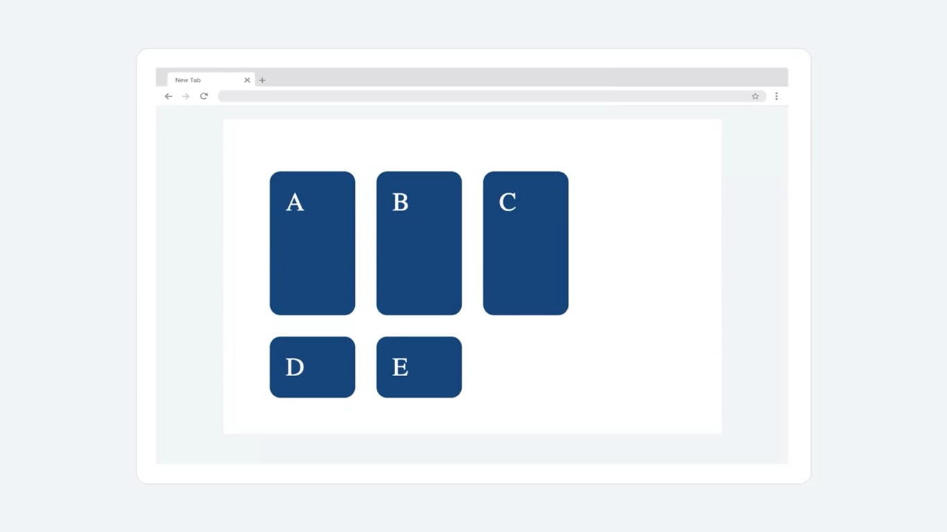
<div class="container">
<div class="box a">A</div>
<div class="box b">B</div>
<div class="box c">C</div>
<div class="box d">D</div>
<div class="box e">E</div>
</div>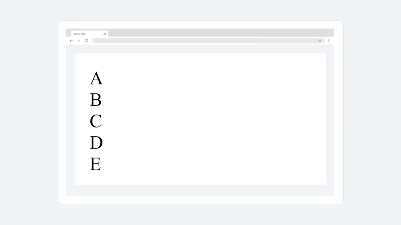
body {
	margin: 20px;
}

.box {
	background-color:#247;
	color: #fff;
	margin: 10px;
	padding: 15px;
	border-radius: 10px;
	font-size: 150%;
}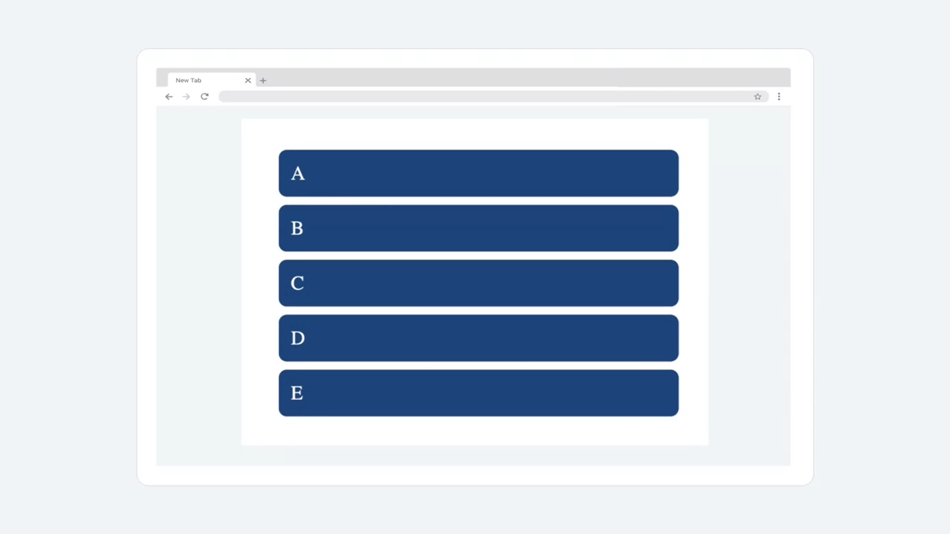
The letters now have a better visual design, but their arrangement on screen is unchanged. The result is that each letter occupies more screen space than is necessary for its size. What’s displayed in the viewport may appear to be a grid, but it’s not actually one. It’s just the default settings of CSS for a layout.
Once you convert this into the grid layout, you’ll be able to recognize the flexibility it can add.
Set the properties of the container class by first assigning a grid value to the display property. The display property is also used to set display types for other designs such as flex, block, inline, and so on. It’s usually a part of container elements inside our code.
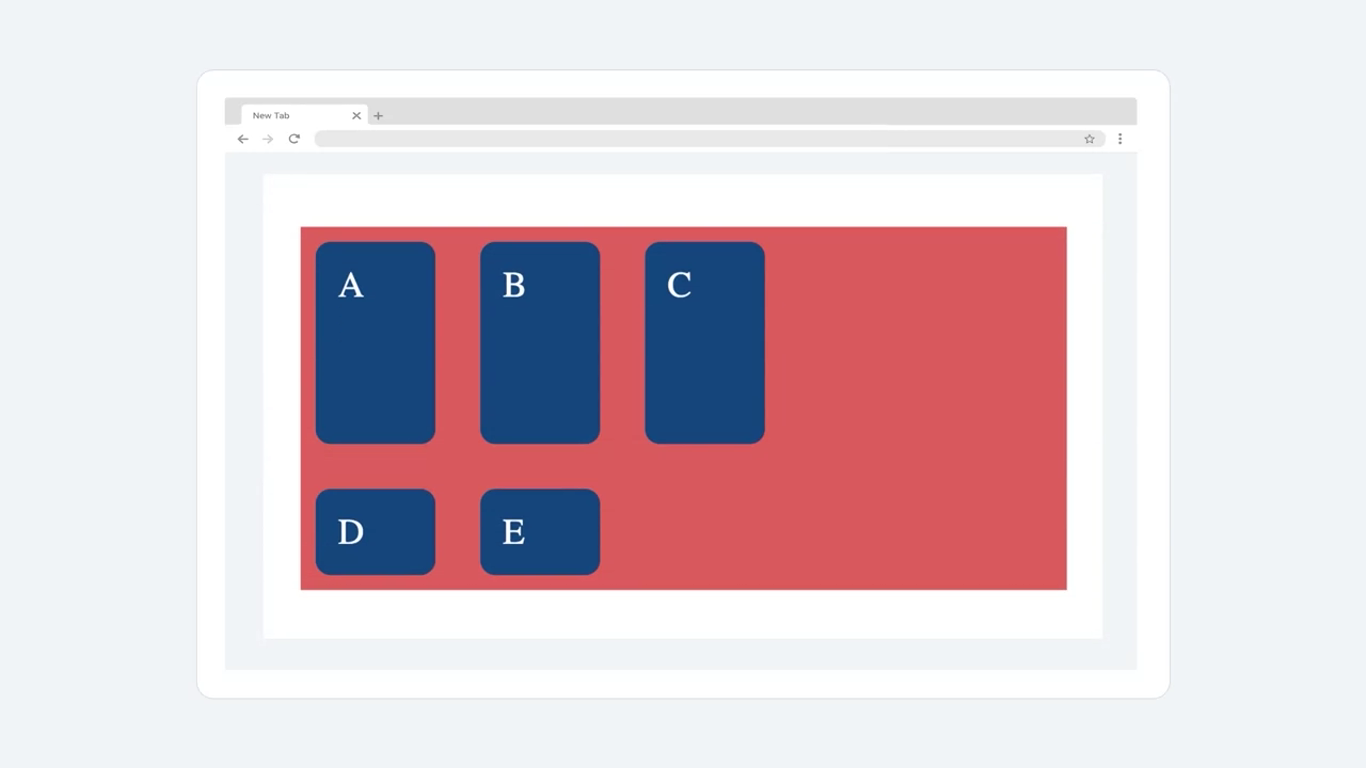
.container {
	display: grid;
	grid-template-columns: 100px 100px 100px;
	grid-template-rows: 2fr 1fr;
}
The grid template columns property has been added into the CSS code to set the size of each of the three columns using pixel values.
The use of fr, which is an abbreviation for fraction, has been introduced. Fraction effectively divides the grid.
The page now displays five separate grid cells around the letters which are arranged in three columns and two rows.
Where applied, the grid tracks are divided proportionately to the ratio of all the fraction values present. As there are two rows, the defined values are sized in the ratio of two to one. Fraction adds flexibility to the grid without needing to deal with actual pixel sizes.
NOTE
It must be noted though, that fraction and pixel sizes can be used interchangeably with both rows and columns.
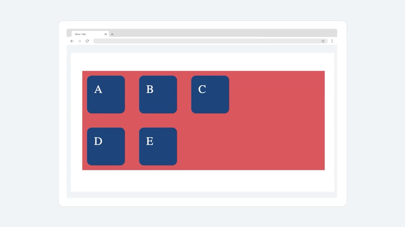
.container {
	display: grid;
	grid-template-columns: 100px 100px 100px;
	grid-template-rows: 2fr 1fr;
	grid-gap: 10px;
	background-color: rgb(202, 96, 96);
}
The updated view displays a red box representing the grid because that’s what the background colors RGB value was set to. The grid stretches by default the entire width of the page and the size of the grid track or gutter has been adjusted to 10 pixels, which leaves more space between the grid cells.
You can also opt to use the auto properties such as grid, auto rows and grid auto columns collectively called the implicit grid.
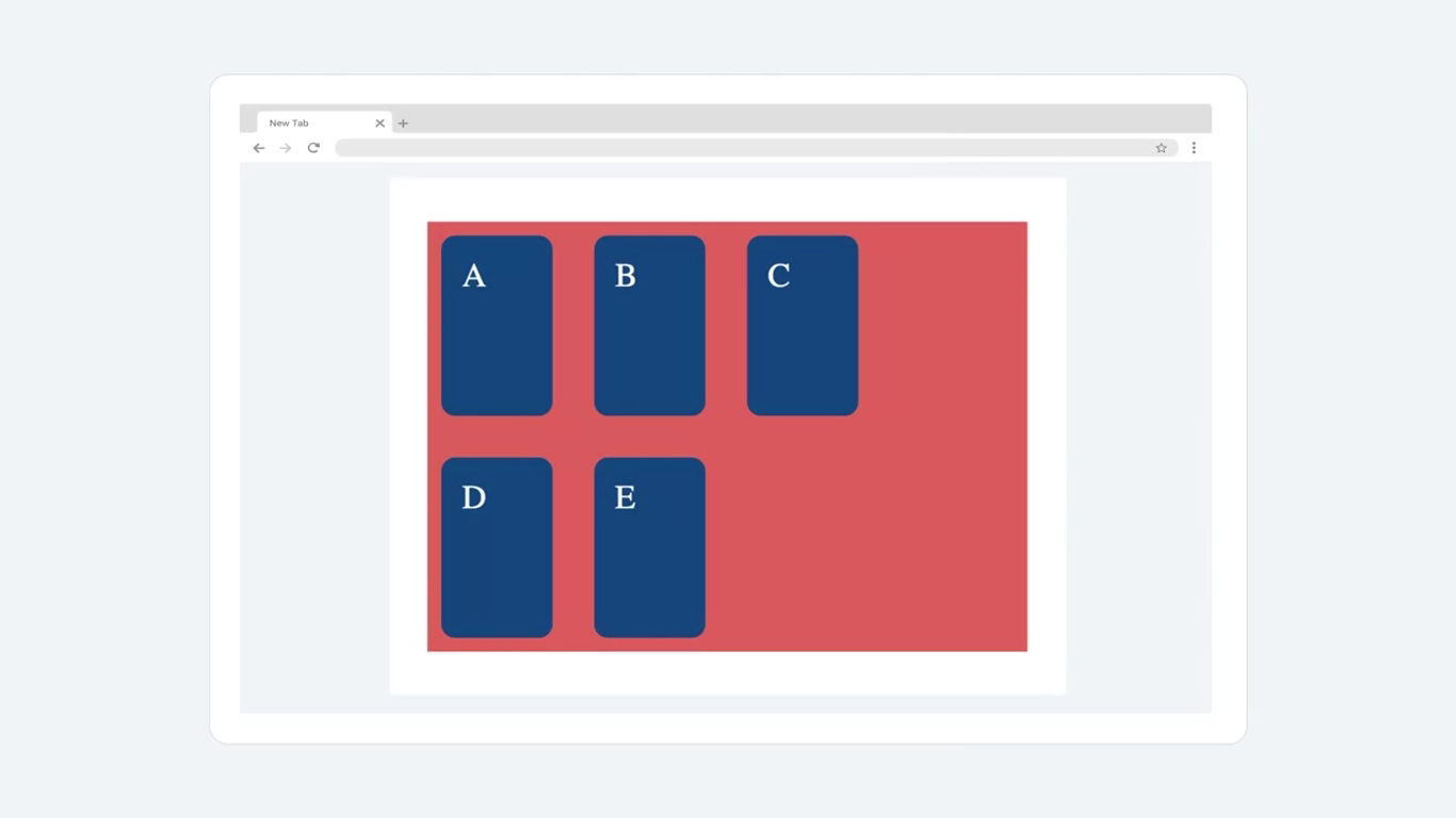
.container {
	display: grid;
	grid-template-columns: 100px 100px 100px;
	grid-auto-rows: 100px;
	grid-gap: 10px;
	background-color: rgb(202, 96, 96);
}
Functions
Repeat
First, the repeat function passes the number of repeats required for a given number of rows and columns. The result of the code adjustment is an unchanged webpage from the last instance because the repeat function didn’t change anything, it just reduced the amount of code you need to write.
.container {
	display: grid;
	grid-template-columns: repeat(3, 100px);
	grid-auto-rows: 100px;
	grid-gap: 10px;
	background-color: rgb(202, 96, 96);
}
Therefore, the repeat function helps reduce redundancy and provides ease of code modification.
Minmax
Next, the min-max function sets the minimum and maximum values expected for the sizes of rows and columns.
.container {
	display: grid;
	grid-template-columns: repeat(3, 100px);
	grid-auto-rows: minmax(150px, auto);
	grid-gap: 10px;
	background-color: rgb(202, 96, 96);
}
The output is modified so that the minimum size of each row is 150 pixels.
Grid frameworks
There are a number of commonly used grid frameworks and layouts. Two such grid design layouts are known as the 12 and 16-column grids. They divide the page into 12 and 16 tracks respectively, along the vertical columns.
The properties can be modified accordingly to target a specific track.
Grids and flexbox cheat sheet
Note: ‘|’ stands for alternatives or OR.
Grid
The syntax for creating a grid:
selector{
    display: grid; /* or inline-grid */
}
Grid shorthand consists of the following properties with default values:
grid
A grid will allow you organize the various elements on your page.
grid-template-rows: none
This feature allows you configure your elements so that they are organized similarly to rows on a table.
grid-template-columns: none
This feature allows you configure your elements but with this setting the elements are organized like columns on a table.
grid-template-areas: none
This feature allows you configure the names of a grid and how they sit in relation to one another.
grid-auto-rows: auto
Default setting for all row sizes that have not been explicitly configured.
grid-auto-columns: auto
Default setting for all column sizes that have not been explicitly configured.
grid-auto-flow: row
Default location for rows that are not explicitly allocated.
column-gap: normal
This sets the gap between the columns
row-gap: normal
This sets the gap between the rows
Grid properties for container
grid-template-columns: measurement units | % units |repeat()
Defines the line names, and maintains a constant size of column items. Can accept a range of different measurement sizes.
grid-template-rows: measurement units | % units |repeat()
Defines the line names, and maintains a constant size of rows. Can accept a range of different measurement sizes.
grid-auto-columns: measurement unit (fixed value for all columns)
Determines the default size for columns that have not been explicitly configured.
grid-auto-rows: measurement unit (fixed value for all rows)
Determines the default size for rows that have not been explicitly configured.
grid-template: “header header” auto
This allows you define and maintain named cells on a grid
“main right” 75vh
This defines two cells named main and right, that have a sizing of 75% of the viewport height.
“footer footer” 20rem
This defines two cells named footer and footer, that have a sizing of 20 root em (rem). This defines the size in relation to the html font size.
Gap
grid-gap: measurement units
Determines the gap between rows and columns
grid-column-gap: measurement units
Determines the gap between columns
grid-row-gap: m-unit-1 m-unit-2
Determines the gap between columns
Alignment
justify-items: start | center | end | stretch
Defines the default space that is allot to each item on the grid
align-items: start | center | end | stretch
Defines the default space related to an item along the grid’s block axis
place-items: start | stretch /* shorthand for two properties above */
This feature allows you align items with the block and inline directions.
Justification
justify-content: start | center | end | stretch | space-between | space-evenly | space-around
Defines browser allocation of space to content items in relation to the main-axis
align-content: start | center | end | stretch | space-between | space-evenly | space-around
Defines browser allocation of space to content items in relation to cross axis and block axis
place-content: center | start
This feature allows you align items with the block and inline directions.
Positioning
grid-auto-flow: row | column | dense
This relates to how the items are placed automatically within the grid
grid-auto-columns: measurement units
This relates to the size for columns created without specific size specifications
grid-auto-rows: measurement units
This relates to the size for rows created without specific size specifications
Grid properties for items (child)
grid-column: column position /* E.g. 1/2 */
Allows for specifying where on the grid the column is to start.
grid-column-start: column start position
This property determines the starting column position an item is placed on a grid.
grid-column-end: column end position
This property determines the end column position an item is placed on a grid.
grid-row: row position /* E.g. 1/2 */
Allows for specifying where on the grid the row is to start.
grid-row-start: row start position
This property determines the starting row position an item is placed on a grid.
grid-row-end: row end position
This property determines the end row position an item is placed on a grid.
Justification and alignment
justify-self: start | center | end | stretch
Determines how an item is positioned inside its aligned container in relation to the appropriate axis.
align-self: start | center | end | stretch
Aligns an item within a grid area.
place-self: start | stretch /* shorthand for two properties above */
This setting lets one align and justify an item within a block.
Flexbox
The syntax for creating a flexbox:
selector{
    display: flex | inline-flex
}
Here the selector can refer to any of the following flex attributes
- Attribute selector
- Class Selector
- ID Selector
- Type Selectors
- Universal Selectors
The display relates to how you want the selector to be shown. Setting display to flex makes the given selector a flex box. Setting display to inline-flex makes the selector a flex box container while will be inline.
Properties for flexbox container
flex-direction: row | row-reverse | column | column-reverse
It is possible to specify the direction your elements will follow. Traditionally text goes from left to right which is flex’s default setting however it can be set from right to left or even top to bottom. The four flex-direction are:
- row : organized from left to right
- row-reverse: organized from right to left
- column: organized from top to bottom
- column-reverse: organized from bottom to top.
flex-wrap: wrap | nowrap
The standard layout is to plot the elements from left to right in a straight line. The wrap feature allows you customize this to match the size of the window displaying the page.
- wrap: Automatically wrap the items with as the window space gets smaller.
- Nowrap: Default setting, items remain rigid and don’t respond to adjustments made to the window size.
align-items: flex-start | flex-end | center |Stretch
This determines how the flex items are to be positioned on the page. Items can be aligned in a variety of ways
- Flex-start: Similar to standard writing, items start at the top left-hand corner and are positioned from left to right
- Flex-end: Position begins in the bottom right hand corner.
- Center: Item is positioned from the center.
- Stretch: item expands to fill the container.
justify-content: flex-start | flex-end | center | space-between | space-evenly
Justify-content determines the alignment of the flex items.
- Flex-start: goes from right to left along the main axis.
- Flex-end: goes from left to right along the main axis.
- Center: Starting at the middle, alignments expands from there.
- Space-between: first and last item are flush with the left and right wall respectively, every other item is evenly spaced.
- Space-evenly: each item is equidistant from each other and the boundary wall
Properties for flexbox items (child)
flex-grow: factor of flex’s main size
This attribute enables the flex container to grow proportionally to the other containers present.
flex-shrink: factor of flex’s main size
This allows elements to shrink in relation to items around it.
flex-basis: auto | factor of main’s size | measurement unit
The sets the initial main size of an item. It can be overridden if other stylized elements are configured.
order:position in flex /* Set ascending by default */
The standard positioning of items is by source order, however this feature will enable you to configure where the items appear on the page.
align-self: start | center | end | stretch
This determines where on the page the child items will be positioned. Similar to the main flex attributes, start is to the left and end is to the right.
All selectors and their specificity
As you build a website, the complexity of the code might increase to such a point that more than one CSS rule is applied to the same element. Or, you might accidentally add more than one rule over the same element. This results in conflicts as only one rule can be applied to a specific property. For example, the color of a certain p tag can either be blue or white, but not both. CSS engines use something called specificity to resolve these conflicts. Specificity is the ranking or score that helps CSS determine the final rule that will be applied to a given element.
This reading will help you grasp how the element with the ‘highest’ specificity is selected by CSS. But before you read on, it is important to note that these rules only apply in cases where conflicts arise for the properties.
Specificity hierarchy
CSS has a set of rules that it uses to ‘score’ or assign a certain weight to selectors and this creates a specificity hierarchy. Based on the weights, there are four categories in this hierarchy:
- Inline styles
- IDs
- Classes, attributes, and pseudo-classes
- Elements and pseudo-elements
Inline styles
Inline styles are attached to the elements within your HTML code with the ‘style’ attribute. inline styles have the highest specificity. That means that rules that are defined as inline styles will be applied irrespective of other rules.
For example, take these two rules that create a conflict in color styling for a p tag:
<p style=“color: white;”>
p{color: blue}
The p tag will be colored white because it is declared inside the inline tag.
IDs
Next in the hierarchy are IDs and by now you know that they are represented by ‘#’. For example:
#div
Classes, attributes, and pseudo-classes
Classes, and the attributes inside the selectors, come next with what is called the pseudo-classes that you will soon learn more about.
For example:
`.my-class
p[“attribute”]
div:hover `
Elements and pseudo-elements
Finally, elements and something you call pseudo-elements have the lowest position in the specificity hierarchy. You will learn more about pseudo-elements later in this lesson.
Calculating scores
But by now you might wonder how is specificity calculated?
CSS uses the hierarchical model internally to calculate the specificity of the selectors used on a web page. But often as the size of CSS code increases, developers unavoidably face rule conflicts. In these cases, developers use the specificity hierarchy to calculate the precedence of CSS rules and to control the outcome of their web pages.
Let’s explore a practical example of how to determine the score of a few selectors.
hello {} will be 0100
div {} will be 0001 and
div p.foo {} will be 0012
In the order stated above, the four categories will be assigned values 1000, 100, 10 and 1 with the element selectors having the lowest value of 1. These scores will be calculated respectively for each element present inside the selector. The total score for these elements is then calculated and the one with the highest value has the highest specificity.
Let’s explore a couple of examples for clarity. Take note that the properties and values are not included in these examples to keep the focus on the selectors only.
Example 1
p {}
div p {}
div p.foo {}
p ⇒ 1 element ⇒ 0 0 0 1 ⇒ Score: 1
div p ⇒ 2 elements ⇒ 0 0 0 2 ⇒ Score: 2
div p.foo {} ⇒ 2 elements and 1 class selector ⇒ 0 0 1 2 ⇒ Score: 12
The third case has a total of 12 for the p tag and so has the highest specificity. The rules for the other two cases are then overridden and the rules inside the third case are applied.
Example 2
p#bar ⇒ 1 element & 1 ID ⇒ 0 1 0 1 ⇒ Score: 101
p.foo ⇒ 1 element & 1 class ⇒ 0 0 1 1 ⇒ Score: 11
p.p.foo ⇒ 1 element & 2 class ⇒ 0 0 2 1 ⇒ Score: 21
By now it should be clear that the case containing ID has a much higher score and the rules inside it will be applied.
The wide range of selectors that you’ve learned about earlier and the different pseudo-classes and pseudo-elements that you will learn about later will help you understand why specificity is important.
While the weights assigned from the hierarchical structure help in a systematic approach, there are a few more guidelines and rules that become important especially in cases when the score for the different selectors is the same. Some of these are:
- Every selector will have a score and place in the hierarchy
- In the case of selectors with equal specificity, the latest or last written rule is the one that will be applied
- In general, ID selector should be applied in cases where you need to be certain about a rule
- Universal selectors have zero specificity value
This reading only gave you an overview of specificity, but you should know that it is a much broader topic and also the underlying basis on which CSS engines work. That’s what the ‘Cascading’ in CSS means: the way in which CSS engines evaluate and apply the specificity rules is called ‘cascade’. Cascade is a type of small waterfall that falls in stages down the rocks and that is exactly how CSS behaves.
Don’t be too worried about applying what you’ve learned now, there are CSS specificity calculators available that can help you with determining the styling outcomes of your pages.
Pseudo-classes
Pseudo-class selectors give developers great control over what they select and style. By knowing how to use these selectors, you will not only improve the interactivity of your web pages, but you will also be able to add advanced styling without too much effort.
These selectors are also often referred to as just pseudo-classes.
Previously, you were briefly introduced to the pseudo-class invalid.
NOTE
Remember, pseudo-classes are state-based selectors, which means that they allow you to select elements based on their state. For example, the hover state.
You use pseudo-class selectors to improve the interactivity of web pages by styling elements in response to user input.
There are many types of pseudo-classes. Other than the hover state, examples include selecting an element when it is active or in-focus, or when a link has already been visited. Pseudo-classes are also very effective to target specific elements such as, let’s say, the fifth item in a list, bold items, empty elements, and so on.
Syntax
Let’s review the general syntax that you use for various pseudo-classes. You add the selector, a colon, the pseudo-class, and then the properties.
selector:pseudo-class {
	property: value
}
Well, there isn’t a broadly accepted classification for pseudo-classes, you can group them in terms of general similarities and their purpose.
Classifications
User action states
The first group you need to know about is user action states, which include:
- The hover pseudo-class, which changes the style of an element when a cursor hovers over it.
- The active pseudo-class, which styles an element only while a user actively presses and holds the mouse button.
- The focus pseudo-class, which focuses styling on the element that you use it for.
These pseudo-classes have an effect while a user is actively engaging with a HTML element.
<body>
	<p class="mypage">This is a link:<a href="#">Hover over me</a></p>
	<div class="wrapper">
		<button class="mybutton">Long press and hold this button</button>
	</div>
</body>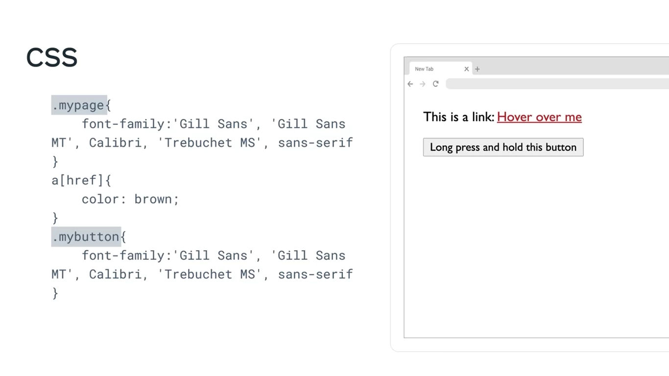
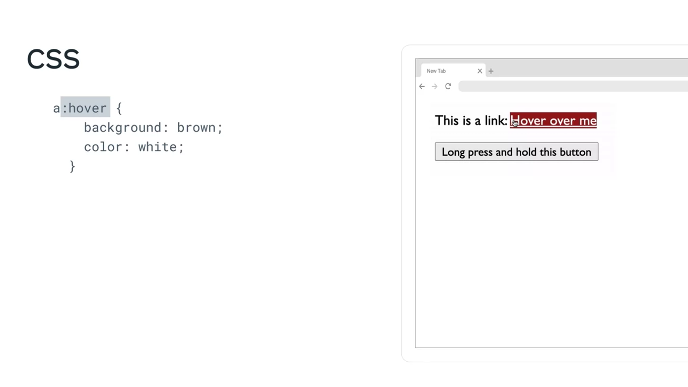
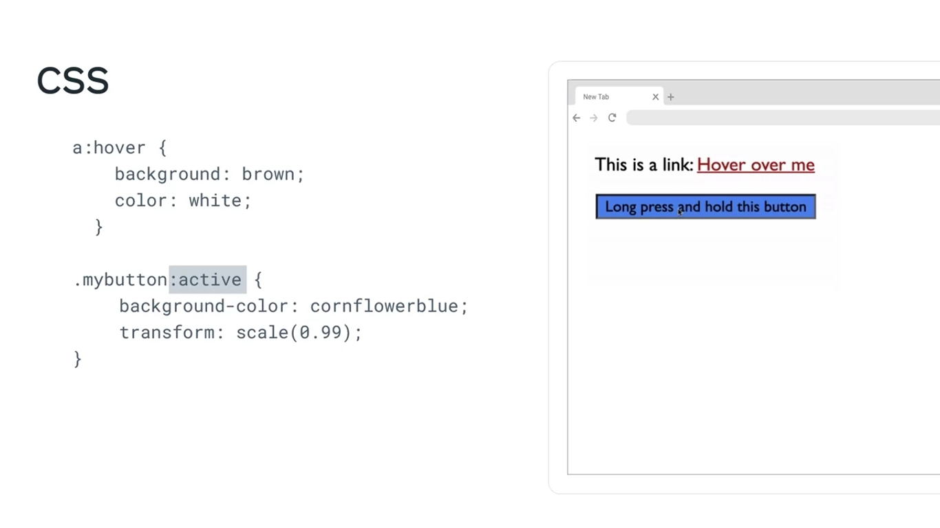
In this example, the pseudo-class selectors target HTML elements, but you can also use them to target HTML class attributes.
Form states
Previously, when discussing form validation you were introduced to the invalid pseudo-class selector. But there are more pseudo-classes that are specifically used for HTML forms. They usually come in pairs and target the different states that elements can have.
Form state pseudo-classes include:
- disabled and enabled, generally used for buttons
- checked and indeterminate, that are used for checkboxes
- valid and invalid used in case of fields like emails and phone numbers
Specific position-based states
They allow you to target specific items, for instance, a specific list item among the list elements. Some examples of this type include:
- first-of-type,
- last-of-type,
- nth-of-type,
- nth-last-of-type.
<body>
	<ul>
		<li> Adrian </li>
		<li> Mario </li>
	</ul>
</body>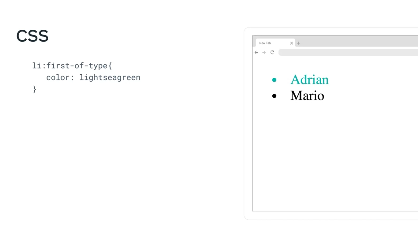
Pseudo-elements
Pseudo-elements help you style a specific part of an element. For example, you can decide to apply styling to only the first word or line in a given element. First, let’s examine the syntax of a pseudo-element.
Syntax
`selector::pseudo-element {
property: value;
}`
It is important to note that pseudo-elements use two colon (::) characters instead of one.
Now, let’s explore some examples of popular pseudo-elements.
Setting up the HTML and CSS files
You can practice the pseudo element code blocks below by adding the respective code inside the HTML and CSS files. Additionally, reference the CSS code in HTML by adding a link tag such as:
<link rel="stylesheet" href="style.css">
where style.css is the name of your CSS file.
Additionally, add the HTML code inside the <body> tag in the HTML file. A sample code block for HTML will appear as below:
<!DOCTYPE html>

<html>
<head>
  <link rel="stylesheet" href="style.css">
</head>

<body>
    <!-- Add your HTML code here -->
</body>

</html>
Once both the HTML and CSS code is in place, right click on the HTML file in your VSCode side menu Explorer and select Show Preview. It will open a built-in VSCode Browser where you can preview the code.
Below are a few examples of the different pseudo-elements you can use:
::first-letter
You can use the first-letter pseudo-element to change the color of just the first letter of each of the three points in the example text.
HTML code:
<!DOCTYPE html>
<html>
<head>
<link rel="stylesheet" href="pseudo4.css">
</head>
<body>
<ul>
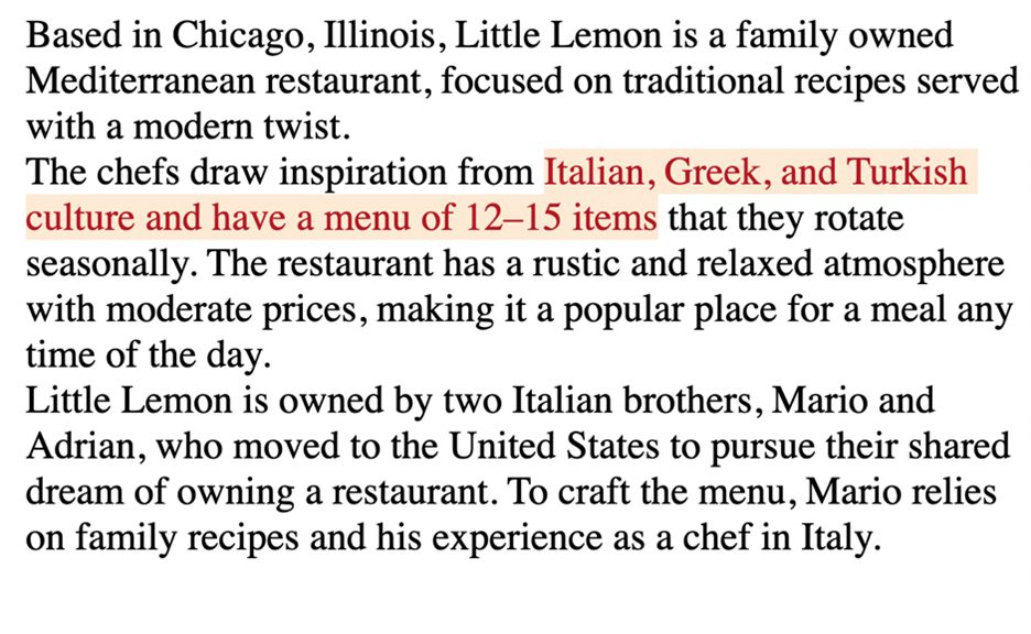
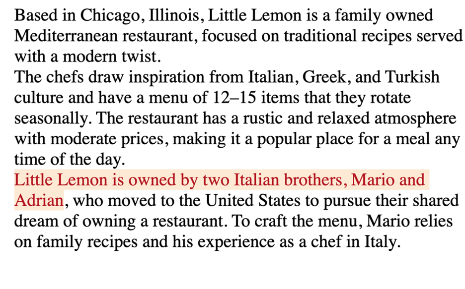
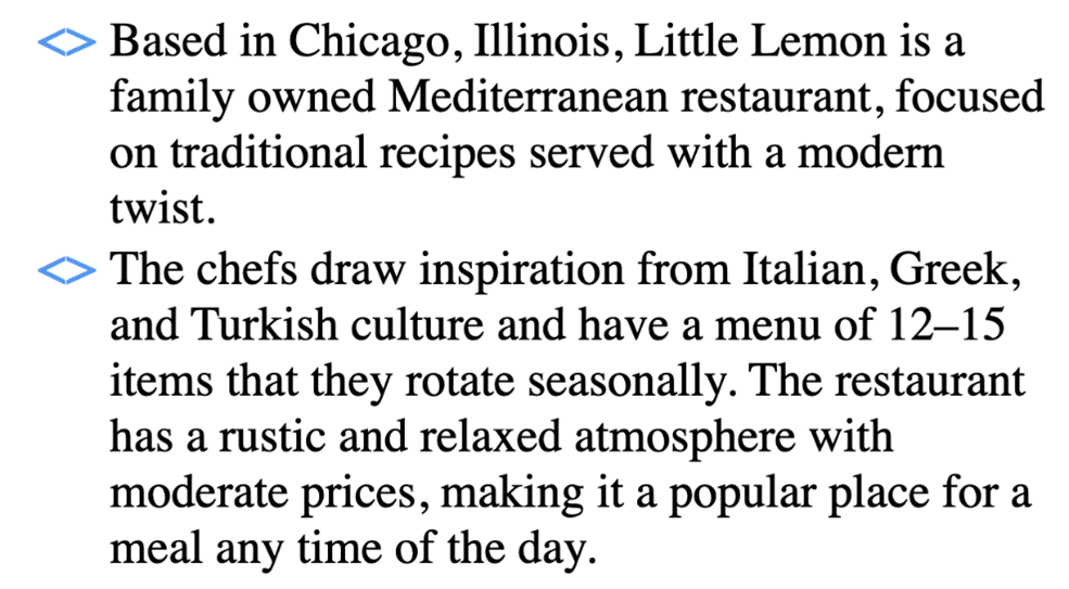
<li>Based in Chicago, Illinois, Little Lemon is a family-owned Mediterranean restaurant, focused on traditional recipes served with a modern twist. </li>
<li>The chefs draw inspiration from Italian, Greek, and Turkish culture and have a menu of 12–15 items that they rotate seasonally. The restaurant has a rustic and relaxed atmosphere with moderate prices, making it a popular place for a meal any time of the day.</li>
<li>Little Lemon is owned by two Italian brothers, Mario and Adrian, who moved to the United States to pursue their shared dream of owning a restaurant. To craft the menu, Mario relies on family recipes and his experience as a chef in Italy.</li>
</ul>
</body>
</html> CSS code:
li::first-letter {

color:coral;

font-size: 1.3em;

font-weight: bold;

line-height: 1;

}
Output
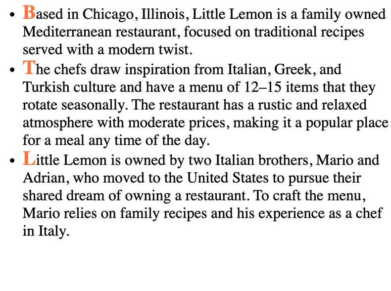
Although the code only changed the first letter of each bullet point, it makes a big difference in terms of presentation. Now let’s change the font in a different way.
::first-line
First-line will change the complete first line of each of the bullet points to light sea green.
CSS code:
ul{
    list-style-type: none;
}

li::first-line {
    color: lightseagreen;
    text-decoration: underline;
    line-height: 1;
}
Output:
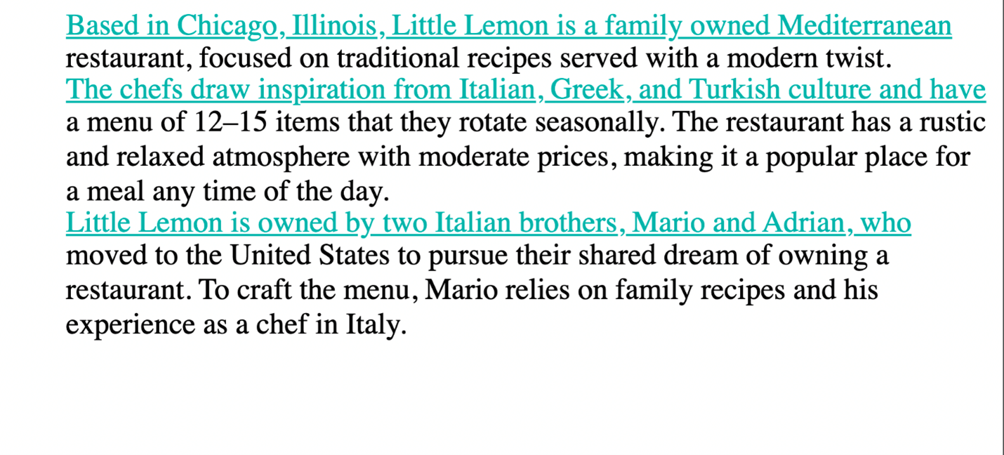
Because it’s only the first line of each bullet point, it almost functions like dividers between the three different points instead of having to rely on bullets.
Note that the contents of the line to which this pseudo-element is applied will change as you increase or decrease the size of your viewport.
Output:
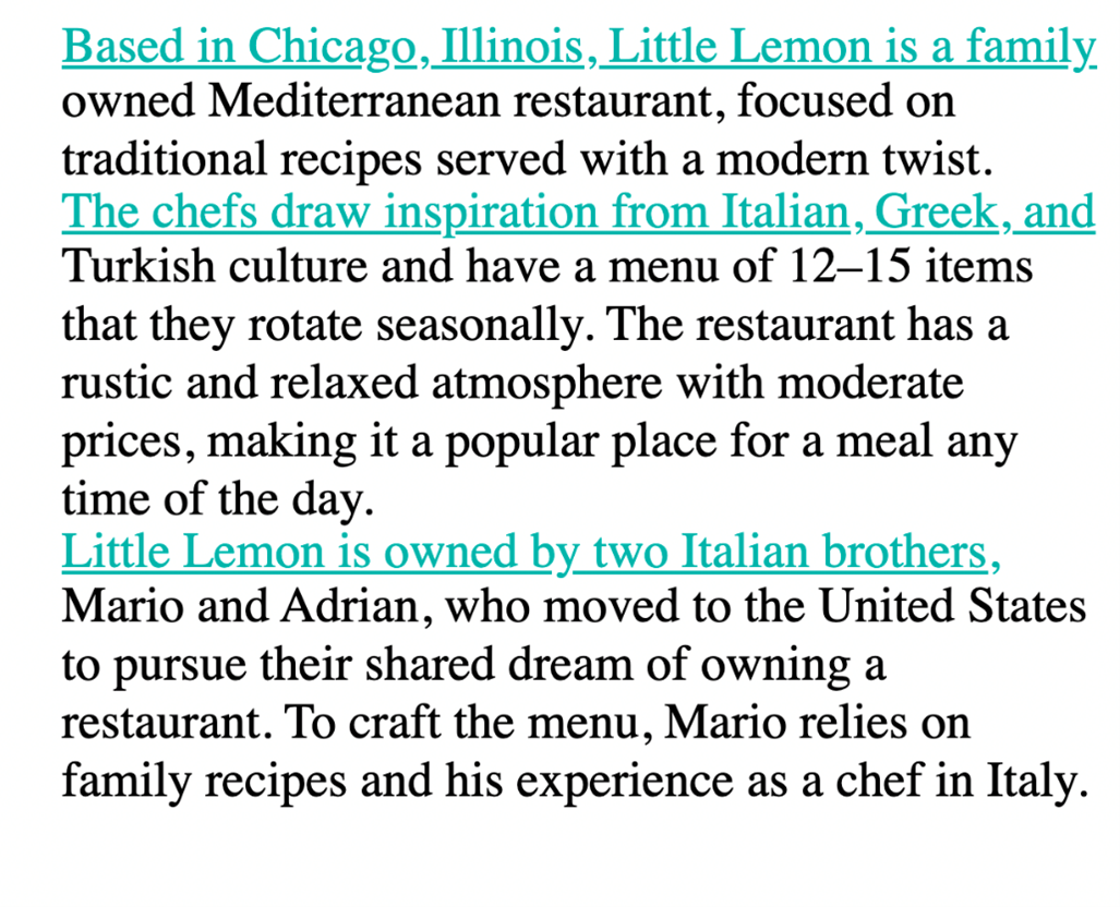
::selection
::selection is another useful pseudo-element. For example, you may use it when you are taking notes on your device because it allows you to highlight specific text. The effect of it becomes obvious only after the user selects content. On web pages today, you will typically see inverted colors from white-black to black-white when selecting a portion of text.
CSS code:
ul{
    list-style-type: none;
}

li::selection {
    color:brown;
    background-color: antiquewhite;
    line-height: 1;
}
Here is an example of a selection of text.
Output:
And another example of the same text but with a different section selected and highlighted.
Output:
Different segments of the text are highlighted depending on the text that is selected at any given point.
::marker
::marker is typically used to add style elements to a list, for instance, to color bullet points. For example, you can enhance the user experience when you use a marker in the following way.
CSS code:
li::marker {
    color: cornflowerblue;
    content: '<> ';
    font-size: 1.1em;
}
Output
Now the bullet points are cornflower blue and they have the shape specified in the code.
::before and ::after
One more pair of pseudo-elements are the ::before and ::after pseudo-elements. They allow you to add content before and after an element on which they are allowed. In other words, new content can be added to a page without adding HTML code for it. You can also add styling options for this content. Let’s do an example where text is added both before and after some cooking guidelines to identify them as important tips.
HTML code:
<body>
    <p id="tips"> Don't rinse your pasta after it is drained. </p>
    <p> Slice the tomatoes. Take the extra efforts to seed them. </p>
    <p id="tips"> Peel and seed large tomatoes. </p>
</body>
CSS code:
#tips::before{
    background: darkkhaki;
    color:darkslategray;
    content: "Tip:";
    padding-left: 3px;
    padding-right: 5px;
    border-radius: 10%;
}

#tips::after{
    background:darkkhaki;
    color:darkslategray;
    content: "!!";
    padding-right: 5px;
    border-radius: 20%;
}
Output:
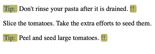
The “content” property is where the text for the guidelines goes. The word “tip” has been added before each guideline thanks to the rules added for tips::before. And, each of the three guidelines now has two exclamation marks after them thanks to the rules added for tips::after. Note how the second <p> element inside the HTML code remains unaffected. You don’t have to use ::before and ::after together like this, but sometimes it is useful to combine them.
Conclusion
The examples covered here illustrate that adding simple code for pseudo-elements can greatly enhance the appearance of websites. There are plenty of other pseudo-elements and some of them are more popular than others. You can follow your own style and explore the creative possibilities that pseudo-classes and pseudo-elements offer.
Additional resources
The following resources will be helpful as additional references in dealing with different concepts related to the topics you have covered in this section.
- Broad overview of layouts in CSS
- Detailed overview of flexboxes
- Detailed overview of grids (1)
- Detailed overview of grids (2)
- Commonly used selectors
- Combinator selectors
- Comprehensive list of selectors
- Comprehensive list of pseudo-classes
- Comprehensive list of pseudo-elements
Previous one → 2.HTML | Next one → 4.JavaScript